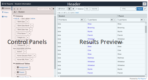
Ad Hoc Report Creator
Learn about the various components of the embeddable Ad Hoc Report Creator client and how to create your own Ad Hoc report.
The Ad Hoc Report Creator is a client of the Export Report REST API which allows a user to create ad hoc reports and data exports. The Report Creator has the following components:
Header
The header displays the current <report> name and the full screen button.
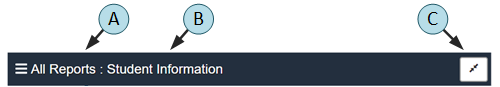
- A. "All Reports" breadcrumb
-
The "All Reports" breadcrumb links to the
Report Repository. - B. Report name
-
The
<report>'snameattribute. - C. Full Screen
-
Toggles the creator between normal and full screen mode.
Press the Full Screen button again or the Escape key to exit full screen mode.
Columns Panel
The Columns panel presents the <report>'s tree graph of related <table>s
and the <column>s available within each table. Additionally, the Columns
panel has controls to add columns to the Export Report REST API result, filter
columns, and view catalog configuration metadata.
The Columns panel focuses one table within the tree graph at a time. Navigate to a different table via the table tree graph popover or table path breadcrumbs.
Columns Panel Header
- A. Columns panel indicator
-
The Columns panel indicator highlights when the columns panel is active.
- B. Table navigation buttons
-
The first two table navigation buttons support back and forward navigation through the history of tables visited in the Columns panel. The buttons are disabled if a particular navigation direction is not available.
The third table navigation button supports navigating up to the parent table in the report table tree graph. The button is disabled if the report's base table has focus within the panel.
- C. Table tree graph
-
Clicking the table tree graph button displays the report's table tree graph in a popover. Within the popover, the focused table is indicated in bold font. Clicking any other table focuses the Columns panel to that table.
- D. Table path breadcrumbs
-
The table path breadcrumbs show the relational join path of the focused table. The focused table is listed at the end of the path in bold font. Clicking any other table within the breadcrumbs focuses the Columns panel to that table.
- E. Search columns input
-
Clicking the search columns input changes the Columns panel to search mode.
- F. Close button
-
Clicking the close button closes the panel.
Columns Panel Body
The Columns panel body lists the <column>s of the currently focused table and provides
controls to add columns to the report export, create filters, and view metadata.
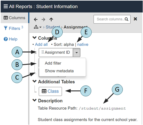
- A. Column label
-
Click or drag column labels into the
Results Previewto add them to the export results. Clicking a label adds the column as the last column in theResults Preview. Dragging a column allows the column to be precisely positioned. The column labels are taken from the<column>'sdisplayNameattribute.When the column is included the export results, a check icon is displayed to the right of the column name. Shift+click a column label to remove that column from the
Results Preview.Any columns attributed as
export='false'are listed separately under theNon-exportable Columnslabel. They may be filtered but not added to the export results. - B. Add filter menu item
-
Select the
Add filtermenu item to open the Filters panel, Create Filter form with the column pre-selected. - C. Show metadata menu item
-
Select the
Show Metadatamenu item to view the<column>metadata such as thedescription,id, andparamType. Clicking the Metadata button again closes the metadata. - D. Add all button
-
Click the
Add allbutton to add all exportable columns from the focused table to the end of the export results. - E. Column order toggle
-
The Column order toggle button toggles the column order between alphabetical (the default) and the native order in which the
<column>s are listed within the<table>configuration. - F. Additional tables
-
The additional tables section lists the child
<relationship>tables of the focused<table>. Clicking a table name focuses the Columns panel to the table.Any additional table with a
cardinalityofmanywill appear stacked.
- G. Description
-
The description section displays the table resource path and table
description, if specified.
Columns Panel Search Mode
The Columns panel search mode supports full text searching of <table> and <column>
displayName attributes and <description>s.
Tables and columns within the search results contain controls to add columns to
the export result and create filters.
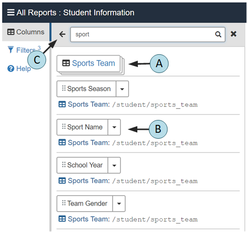
- A. Table search result
-
Click a table search result to focus the table within the Columns panel.
- B. Column search result
-
Column search results contain the same controls for adding the column to the export result, filtration, and metadata viewing as does the Columns panel, normal mode. Additionally, the column's parent table name and path display below the column control to provide additional context.
- C. Return button
-
The return button returns to Columns panel normal mode.
Filters Panel
The Filters panel supports creation and editing of
filter
parameters to be applied to the Export Report REST API export.
Filters Panel Normal Mode
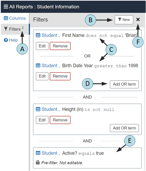
- A. Filter panel indicator
-
The Filters panel indicator reflects the number of filters applied to the Export Report REST API export as a superscript to the
Filterslabel. - B. New filter button
-
Click the
Newbutton to create a new filter to be logically AND'ed together with other filters. - C. Existing filter
-
Each filter term's column, operator, and value information display within the Filters panel with accompanying
EditandRemovebuttons. Multiple filter terms within the same filter are logically OR'ed together. Multiple filters are logically AND'ed together.Click the hyperlinked table name within a filter term to focus the table within the Columns Panel.
Configure default filters via
<default_filter>. - D. Add OR term button
-
Click the
Add OR termbutton to create a new term to be logically OR'ed to the existing terms in the filter. - E. Pre-filter
-
Any
<pre_filter>s applied to the report display as non-editable filters with a lock icon instead of edit controls. - F. Close button
-
Clicking the close button closes the panel.
Filters Panel Create/Edit Mode
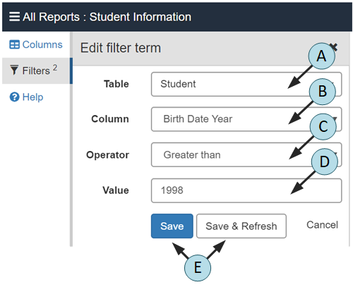
- A. Table selection
-
Drop down list of the
<table>elements available for filtration. - B. Column selection
-
Drop down list of the table's
<column>elements available for filtration based on the selected table. - C. Operator selection
-
Drop down list of the filter operators available based on the selected
<column>'sparamType. - D. Value
-
User supplied value for the filter if applicable for the selected operator.
For
<column>s with a child<label_value_list>element, the user will be able to select one or more of the pre-defined values from a select list. - E. Save buttons
-
Click the
Savebutton to persist the filter term but not apply the filter criteria to the Results Preview. Use theSavebutton when creating multiple filters to prevent unnecessarily refreshing the Results Preview. Then use the Results PreviewRefreshbutton to refresh the preview after completing all filter configuration.Click
Save & Refreshto both persist the filter and refresh the Results Preview.
Results Preview
The Results Preview displays a limited preview of the export results and contains controls to export the
report to any export format.
By default, the Results Preview displays the first 100 records within the exported report.
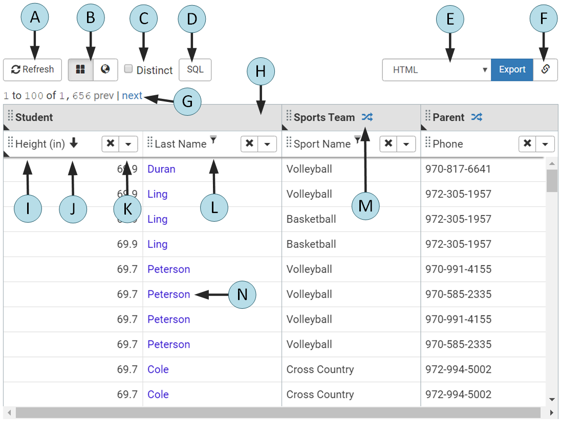
- A. Refresh
-
Refreshes the export results from the database.
The Refresh button turns dark blue to indicate that the current export results are stale due to the creation or editing of a filter or addition of a new column.
- B. View mode buttons
-
Toggles the Results Preview between table and map view. The View mode buttons are only available if the
<report>may be exported to the Pull Reports™ Standard Editiongeojsonformat. - C. Distinct checkbox
-
Toggles the
distinctexport parameter. See the distinct parameter example usage documentation in the REST API guide for more information. - D. SQL dialog button
-
Displays the Structured Query Language (SQL) and query parameters to be used when creating the report export.
The
SQLbutton is visible when the export.sql.active configuration property istruefor the report and the current user is permitted to request the GET Export SQL endpoint. - E. Export format select and button
-
The export format select list displays the available export
formatparameter values. TheExportbutton exports the full report to a new browser window in the chosen format.The
Exportbutton turns red and becomes disabled if the total number of results exceeds the configuredexport.report.maxResults. - F. Export URL dialog button
-
The export URL dialog button reveals the Export Report REST API URL and HTTP parameters to be used when the
Exportbutton is clicked. - G. Pagination indicator and links
-
The pagination indicator and controls display the current page of export results with links to navigate to the previous and next page. The page size is 100 records.
The total number of results displays red if it exceeds the configured
export.report.maxResults. - H. Table cell header
-
Table cell headers are above adjacent columns within the same table. Re-position all columns under the header by dragging the table cell header to the left or right. Click the remove button to remove all columns under the header from the export results.
A table description indicator appears in the lower left corner of the header if the associated
<table>element has a<description>. Click the indicator to display the description. - I. Column cell header
-
Column cell headers are above each column. Re-position a column by dragging the column cell header to the left or right.
A column description indicator appears in the lower left corner of the header if the associated
<column>element has a<description>. Click the indicator to display the description.Adjust column width by dragging the column border to the left or right. The Report Creator saves the adjusted width in the browser's local storage so that the custom width persists between preview refreshes.
- J. Sort indicator
-
Column cell headers display an ascending or descending indicator if the respective sort is applied to the column.
- K. Column cell header controls
-
Click the Column cell header remove button to remove the column from the export results. Click the Column cell header menu button to display additional controls for column sorting, filtering, and positioning.
- L. Filter indicator
-
Column cell headers display a filter icon if the column is used within a filter.
- M. Cross join indicator
-
The cross join indicator displays within a table cell header when the table contributes to a cross join in the report export. Cross joins happen when multiple tables in a to-many join relationship to the base table are included in the report export without a join condition.
Clicking the indicator button opens a dialog which explains the cross join and possible courses of action.
- N. Column hyperlinks
-
<column>s with a child<url_template>element have hyperlinked values.
Creator Parameter API
Reference documentation for how to configure the Report Creator embeddable client via HTTP query parameters in order to set the current report, filters, sort, and more.
The Pull Reports™ Report Creator responds to HTTP parameters encoded within the browser's location.
Use these parameters to construct a URL to load a specific <report>
within the creator, set filters, and sort or include columns.
For instance, if the web page into which the Report Creator is embedded is
http://www.mycompany.com/reports/index.html, then a url structured
as
http://www.mycompany.com/reports/index.html?catalogId=mycatalog&reportId=myreport&filter=%40id%20%3E%20100
will load the <report> of id myreport
within <catalog> with id mycatalog and apply
the filter @id > 100.
HTTP parameters
- catalogId
-
Designates the
<catalog>idto load. - columns
-
Designates the columns to be included within the Result Preview panel. The
columnsparameter value is formatted identically to the Export Report REST APIcolumnsparameter. - distinct
-
Boolean value which sets the "Distinct" checkbox of the Result Preview panel.
- filter
-
Designates the filters to be applied to the results within the Result Preview and Filters panel. The
filterparameter value is formatted identically to the Export Report REST APIfilterparameter.See
<default_filter>for how to configure default filter values. - offset
-
Designates the result offset of the Result Preview panel.
- reportId
-
Designates the
<report>idto load. - sort
-
Designates the sort to be applied to the columns of the Result Preview panel. The
sortparameter value is formatted identically to the Export Report REST APIsortparameter.